Designing an Async Confirmation Dialog
2023-08-30

I find my current implementation of confirmation dialogs is difficult to read which is to bake in both the visual state and the resulting actions into one component. Sure it works - however, when I read the code sometime later, I find that it’s difficult to digest. And so, I wanted to explore implementing a confirmation dialog in a way that could be easier to understand.
Quick Definitions
A modal is any popup that visually appears above the current page, capturing the user’s attention for a task that requires immediate action. It’s a blocking element meaning that the modal’s task needs to be completed before the user can continue.
A confirmation is a subset of a modal that acts as a safety net before an action and is typically used with destructive actions - i.e user confirmation before deleting an account. While the async method we discover below can be altered to fit all modals, in this post we will only focus on confirmation dialogs to keep the scope limited.
A Simple Example
In this post, we will design and implement a confirmation dialog to verify that user wants to delete their account. Let’s get started by understanding the different states that this problem can be in - drawing out the user’s flow.
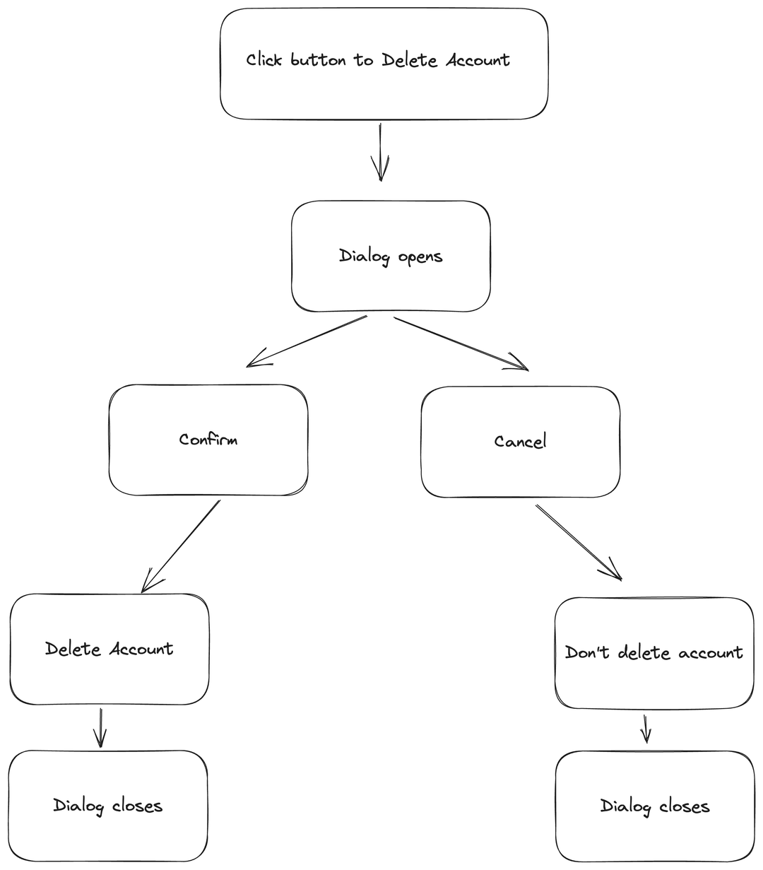
Before we get started on the async solution, here is a simple implementation of the above flow chart. This is quite similar to how I used to implement my confirmation dialogs.
export function DialogDemo() {
  //Controls the visual state of dialog
  const [showConfirmDialog, setShowConfirmDialog] = useState(false);
  const { toast } = useToast();

  const handleOpenDialog = () => {
    setShowConfirmDialog(true);
  };

  const handleCancel = () => {
    setShowConfirmDialog(false);
    toast({
      title: "Phew, that was close!",
    });
  };
  const handleConfirm = () => {
    setShowConfirmDialog(false);
    toast({
      title: "Account deleted",
      variant: "destructive",
    });
  };

  return (
    <>
      <Button onClick={handleOpenDialog}>Delete Account</Button>
      <Confirmation
        // Additional props to make this a reusuable component
        title="Are you sure?"
        description="This action is permanent. You cannot undo this action."
        confirmLabel="Delete Account"
        isOpen={showConfirmDialog}
        // Actions to be run upon cancellation.
        onCancel={handleCancel}
        onConfirm={handleConfirm}
      />
      <Toaster />
    </>
  );
}

type ConfirmationProps = {
  title: React.ReactNode,
  description: React.ReactNode,
  confirmLabel: string,
  isOpen: boolean,
  onConfirm: () => void,
  onCancel: () => void,
};
const Confirmation = (props: ConfirmationProps) => {
  return (
    //Alert Dialog shows the component depending on the state of the open prop
    <AlertDialog open={props.isOpen}>
      <AlertDialogContent>
        <AlertDialogHeader>
          <AlertDialogTitle>{props.title}</AlertDialogTitle>
          <AlertDialogDescription>{props.description}</AlertDialogDescription>
        </AlertDialogHeader>
        <AlertDialogFooter>
          <AlertDialogCancel onClick={props.onCancel}>Cancel</AlertDialogCancel>
          <AlertDialogAction onClick={props.onConfirm}>
            {props.confirmLabel}
          </AlertDialogAction>
        </AlertDialogFooter>
      </AlertDialogContent>
    </AlertDialog>
  );
};
In the parent component DialogDemo we’ve defined 3 functions that manages opening the dialog and the actions that will be run upon confirmation and cancellation. The visual state is managed here via the showConfirmDialog state variable. All these are then passed as props into a reusable Confirmation component which is a wrapper around Shadcn’s excellent AlertDialog , powered by Radix UI which manages the UI parts of the rendering.
Solution Design
Motivation
“Indeed, the ratio of time spent reading versus writing is well over 10 to 1. We are constantly reading old code as part of the effort to write new code. ...[Therefore,] making it easy to read makes it easier to write.” ― Robert C. Martin, Clean Code: A Handbook of Agile Software Craftsmanship
Missing unsupported block here
While the above solution implements the flow chart, when reading the code, I find that it lacks clarity in explaining the confirmation dialog progresses from one state to another.
I wanted to create an abstraction with improved readability that would allow the reader to understand what’s happening in a procedural manner.
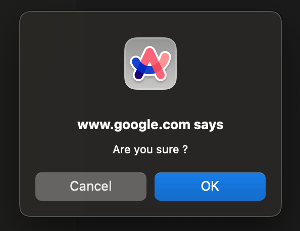
I was inspired from browser native confirm api. Here is how it works - by calling the confirm() function, a synchronous modal opens with the text you passed in as a parameter. It stops code execution on your app as it blocks the javascript thread until a response is provided. The response is provided via two buttons, Cancel and OK. If the user selects OK, the function returns true, else it returns false.
There are clear drawbacks in terms of customisation. This includes the fact that the modal appears in a separate window and the labels and dialog cannot be modified. In terms of performance, the function runs synchronously, meaning that all background code execution in your app is paused until the user responds.
Following the api of the native confirm method, I want to explore implementing a component that can be asynchronously closed. When I consume this api, it should look like this
const handleDelete = async () => {
	// This should automagically open the dialog
  const result = await getConfirmation();

  // The following code should only execute after the dialog is closed by the user.
  if (result === true) {
    // Confirm was clicked
    runCofirmAction();
  } else {
    // Cancel was clicked
    runCancelAction();
  }
};
Implementation
Let’s break down what we’re trying to accomplish here. We need to wait on a promise that opens the dialog when it starts. This promise is only resolved when either the confirm or cancel button is clicked, returning true or false respectively. We can then use this boolean to control the flow of the code and execute the corresponding action.
Encapsulating the Visual State logic
Let’s start by creating a simple hook called useConfirm to contain the opening and closing of the dialog. This hook should return two objects, a function which can trigger opening the modal and the modal component itself.
import {
  AlertDialog,
  AlertDialogAction,
  AlertDialogCancel,
  AlertDialogContent,
  AlertDialogDescription,
  AlertDialogFooter,
  AlertDialogHeader,
  AlertDialogTitle,
} from "@/components/ui/alert-dialog";
import { useState } from "react";

export const useConfirm = () => {
  const [isOpen, setOpen] = useState(false);

  const getConfirmation = () => {
    setOpen(true);
  };

  const handleClick = (value: boolean) => {
    setOpen(false);
  };

  type ConfirmationProps = {
    title: React.ReactNode;
    description: React.ReactNode;
    confirmLabel: string;
  };
  const Confirmation = (props: ConfirmationProps) => {
    return (
      <AlertDialog open={isOpen}>
        <AlertDialogContent>
          <AlertDialogHeader>
            <AlertDialogTitle>{props.title}</AlertDialogTitle>
            <AlertDialogDescription>{props.description}</AlertDialogDescription>
          </AlertDialogHeader>
          <AlertDialogFooter>
            <AlertDialogCancel onClick={handleClick}>Cancel</AlertDialogCancel>
            <AlertDialogAction onClick={handleClick}>
              {props.confirmLabel}
            </AlertDialogAction>
          </AlertDialogFooter>
        </AlertDialogContent>
      </AlertDialog>
    );
  };

  return { getConfirmation, Confirmation };
};
Awesome, now we’re headed somewhere ! Let us also rewrite our parent component to consume the new useConfirm hook.
function DialogDemo() {
  const { getConfirmation, Confirmation } = useConfirm();

  const handleDelete = () => {
    getConfirmation();
  };
  return;
  <>
    <Button onClick={handleDelete}>Delete</Button>
    <Confirmation
      title="Are you sure?"
      description="This action is permanent. You cannot undo this action."
      confirmLabel="Delete Account"
    />
  </>;
}
Promisifying the function
The last part of this implementation, the meat and potatoes of this problem involves awaiting on the dialog. This involves using a promise that should start when the function is called and is only resolved when either the confirm or cancellation button is clicked. If you’ve only consumed promises and not really created your own promise, now is a great time to read up on how a promise actually works. Here in the MDN article
Here is what the skeleton of a promise looks like
//If you're using typescript, casting the promise as a boolean allows the
//typechecker to know that the result of the promise will be a boolean

const isEven = (n: number) =>
  new Promise() <
  boolean >
  ((resolve, reject) => {
    /* If the promise cannot be completed, reject with a response
			 that can be caught with error handling
		*/
    if (typeof n !== "number") {
      reject("invalid input type");
    }

    // Execute the code within the promise
    const result = n % 2 === 0;
    /* Resolve with the result which will be accessible after the promise is
		awaited */
    resolve(result);
  });

const isFiveEven = await isEven(5);
//isFiveEven results in false
Notice how resolver and rejector parameters are only available within the scope of the executor function that is passed into the promise. This is a problem in the context of the confirmation dialog, since this promise should only be resolved upon user action. For example
const getConfirmation = () => {
  setOpen(true);
  const promise = new Promise<boolean>((resolve) => {
    //Only call resolve when the user clicks on a button.
  });
  return promise;
};
This means that the resolver needs to be accessible outside of the promise itself and here we use React’s useRef hook to leverage this. When the promise is created, we assign the resolver to the ref. Then, when the user clicks on the confirmation or cancellation, we can use the ref to resolve the promise appropriately.
const resolver = useRef<null | ((value: boolean) => void)>(null);
const [open, setOpen] = useState(false);

const getConfirmation = () => {
  setOpen(true);
  const promise = new Promise<boolean>((r) => {
    resolver.current = r;
  });
  return promise;
};

const handleClick = (value: boolean) => {
    setOpen(false);
    if (resolver.current === null) {
      throw new Error(
        "Resolver hasn't been set ! This is caused when you call onClick() before calling getConfirmation()"
      );
    }
    resolver.current(value);
  };

const handleConfirm = () => handleClick(true);
const handleCancel = () => handleClick(false);
Awesome ! Let’s add this to our useConfirm to promisify awaiting on the dialog for user input.
import {
  AlertDialog,
  AlertDialogAction,
  AlertDialogCancel,
  AlertDialogContent,
  AlertDialogDescription,
  AlertDialogFooter,
  AlertDialogHeader,
  AlertDialogTitle,
} from "@/components/ui/alert-dialog";
import { useRef, useState } from "react";

export const useConfirm = () => {
  const [isOpen, setOpen] = useState(false);
  const resolver = useRef<null | ((value: boolean) => void)>(null);

  const getConfirmation = () => {
    setOpen(true);
    const promise = new Promise<boolean>((r) => {
      resolver.current = r;
    });
    return promise;
  };

  const handleClick = (value: boolean) => {
    setOpen(false);
    if (resolver.current === null) {
      throw new Error(
        "Resolver hasn't been set ! This is caused when you call onClick() before calling getConfirmation()"
      );
    }
    resolver.current(value);
  };

  const handleConfirm = () => handleClick(true);
  const handleCancel = () => handleClick(false);

  type ConfirmationProps = {
    title: React.ReactNode;
    description: React.ReactNode;
    confirmLabel: string;
  };
  const Confirmation = (props: ConfirmationProps) => {
    return (
      <AlertDialog open={isOpen}>
        <AlertDialogContent>
          <AlertDialogHeader>
            <AlertDialogTitle>{props.title}</AlertDialogTitle>
            <AlertDialogDescription>{props.description}</AlertDialogDescription>
          </AlertDialogHeader>
          <AlertDialogFooter>
            <AlertDialogCancel onClick={handleCancel}>Cancel</AlertDialogCancel>
            <AlertDialogAction onClick={handleConfirm}>
              {props.confirmLabel}
            </AlertDialogAction>
          </AlertDialogFooter>
        </AlertDialogContent>
      </AlertDialog>
    );
  };

  return { getConfirmation, Confirmation };
};
And now, it’s finally time to consume our custom hook. Here is how that could look like
import { Button } from "@/components/ui/button";
import { useConfirm } from "./useConfirm";
import { Toaster } from "@/components/ui/toaster";
import { useToast } from "@/components/ui/use-toast";

export function DialogDemo() {
  const { Confirmation, getConfirmation } = useConfirm();
  const { toast } = useToast();

  const handleDeleteAccount = async () => {
    const result = await getConfirmation();
    if (result === true) {
      toast({
        title: "Account deleted",
        variant: "destructive",
      });
    } else {
      toast({
        title: "Phew, that was close!",
      });
    }
  };

  return (
    <>
      <Button onClick={handleDeleteAccount}>Delete Account</Button>
      <Confirmation
        title="Are you sure?"
        description="This action is permanent. You cannot undo this action."
        confirmLabel="Delete Account"
      />
      <Toaster />
    </>
  );
}
I love how much cleaner this implementation is. The messy visual state logic is abstracted away, and the handleDeleteAccount clearly shows what is happening. First we’re waiting on the confirmation and depending on the confirmation the corresponding toast is shown !